Index
- 1. Introduction to MyQttHub markup language
- 2. Reference implementation
-
3. Integrating data from topics
4. Attributes reference - 4. List of common attributes
- 4.1 Size attribute
- 4.2 Icon attribute
- 4.3 Color attribute
- 4.4 Href attribute
- 4.5 Transition attribute (declaring visual effects)
- 4.6 Toast attributes
- 4.7 Configuring warning and critical colors
-
4.8 Configuring date-format for date values
5. Panel and dashboard components: - 5. List of elements and controls
- 5.1 Header declaration (<header />)
- 5.2 Stat declaration (<stat />)
- 5.3 Button declaration (<button />)
- 5.4 Message declaration (<message />)
- 5.5 Grid declaration (<grid />)
- 5.6 P declaration (<p />)
- 5.7 Toggle button declaration (<toggle />)
-
5.8 Rotation button (multi-state <button/>+<check-status />)
6. State management: - 6. Making panel items to react to last status (<check-status />)
1. Introduction to MyQttHub markup language
The following reference describes MyQttHub markup language used to create integrated dashboards with your MyQttHub (so called panels). As you will see, this markup language is XML oriented and has several similarities with HTML language.
The language allows you to easily describe panels and dashborads that can take advantage of the data that was published, retained or stored in your MQTT HUB.
2. Reference implementation
Here you have a list of panels that are created to show ready to use examples so you can start quickly.
Language reference
3. Integrating data from topics
Use the following format (attributes) to configure any particular element supporting showing data from topics:
-
CASE A: topic=“topic/filter/to/show” : this will show last data published/retained for topic topic/filter/to/show. In case topic filter is a string or a raw value, content will be shown as is. In case it has a JSON object, the first attribute from that JSON object will be shown.
-
CASE B: topic=“topic/filter/to/show” attr-name=“temp” : this will work as CASE A but allow to configure the attribute that will be accessed to show data. CASE B assumes JSON content will be found at topic/filter/to/show. In case JSON object found is a complex one (with several nested levels) the platform will look recursively for the first appearance of access-name attribute (in this example “temp”).
-
CASE C: topic=“topic/filter/to/show” access-attr=“attr1.attr2.attr3” : this case extends previous cases by providing full support to navigate to a especific location at the JSON object published at the topic= indicated. Given the example access-attr=“device.core.part.temp”, this will access to json object[“device”][“core”][“part”][“temp”].
Along with these cases, you can also add a suffix and a prefix to data so you can better express units and any other indication that completes the value. For that use:
- suffix="<string>" : adds a suffix to the data that is finally shown.
- prefix="<string>" : adds a prefix to the data that is finally shown.
Some examples using integrated data from topics:
<stat topic="home/device1/temp" attr-name="temp" />
You can use a filter to catch on the element the last value of a group of topics:
<stat topic="home/+/temp" attr-name="temp" />
4. List of common attributes
4.1 Size attribute
Size attribute can be used to control how big or small is shown a particular element. These are allowed values that are generally supported:
-
Nouns (i.e. size=“big”) : from smaller to bigger: mini, tiny, small, medium, large, big, huge, massive
-
Html values (i.e. size=“32px”) : supported declarations uses px, em and pt suffix.
4.2 Icon attribute
MyQttHub uses icons provided by FomanticUI/SemanticUI. You can find the list of icons available here:
https://fomantic-ui.com/elements/icon.html
Also, when configuring icons, you can use source code item configuration to search and configure icons:
4.3 Color attribute
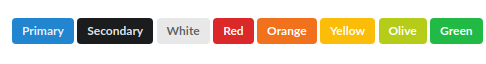
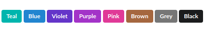
Many Myqtthub controls support color= attribute to configure the main color or different secondary colors (as icon-color=). All of them supports the following colors:
-
So, if you want to configure “blue”, just configure:
color="blue" -
You can also configure hexadecimal colors like:
color="#c9c9c9"
4.4 Href attribute
Any element can have href=“url” attribute. It works as a regular <a href=“url” /> declaration. You can use it to create <button /> or <stat /> declarations.
List of elements supporting href attribute: supported in all elements.
4.5 Transition attribute (declaring visual effects)
Several elements allows to configure a transition="" declaration. It enables a particular visual effect on the element configured. Transitions currently supported are described here (https://fomantic-ui.com/modules/transition.html). To name some, these are commonly used transition:
- fade up
- fade
- fade down
- fly down
- fly up
- scale
- zoom
- jiggle
- flash
- shake
- pulse
List of elements supporting transition attribute:
- doc
- button
- stat
- message
- grid
- refresh-button
- last-update
- image
- header
4.6 Toast attributes
When a panel item sends a MQTT message (for example a <button/> or a <toggle/>), the panel shows a Toast Message to acknoledge the user that the message has been sent, that is, the action has been triggered:
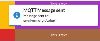
You have the following options that are generic for all panel items that are capable of sending a message:
-
disable-toast : boolean : if configured to true, yes or 1, it disables showing any toast when a message is sent.
-
toast-title : string : optional : allows to configure toast title (toast-title=“title to show”). If nothing is configured, generic title is used by default.
-
toast-message : string : optional : allows to configure toast message (toast-msg=“Message to show”). If nothing is configured, a generic message is shown.
-
toast-duration : number : optional : milliseconds : Allows to configure for how long toast message will be shown before fading. If nothing is configured 1400 milliseconds is used by default.
-
toast-icon : string : optional : Allows to configure icon to be shown at the toast dialog. If nothing is configured a generic icon is used.
4.7 Configuring warning and critical colors
For some elements like <stat />, it is possible to configure warning and critical colors. It can be done by percentage but also when reached some value:
-
critical-above-value : flags element as critical in case value is above indicated by this attribute.
-
critical-threshold : configures percentage above which element is considered critical.
-
warning-above-value : flags element as warning in case value is above indicated by this attribute.
-
warning-threshold : configures percentage above which element is considered as a warning.
In case critical level is reached red color is applied by default. In case warning level is reached, yellow color is applied. You can configure colors for warning and critical with:
-
critical-color : configure a different color from default (red) to activate in case critical level is reached.
-
warning-color : configure a different color from default (yellow) to activate in case warning level is reached.
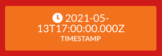
4.8 Configuring date-format for date values
It is possible to configure a date-format="" attribute that allows parsing value reported by a topic, interpreting it as a date, changing representation and/or selecting which values to show.
-
If you publish the following values to a given topic:
- “2021-05-13T14:00:00.000Z”
- 1620923335.936058
-
Then, you can configure a date-format attribute like the following example to parse and better format result shown to the user:
<stat topic='some/topic' attr-name='some-value' date-format='dd/MM/yyyy (hh:mm)' > -
That will cause the <stat /> declaration to avoid showing raw value received by last publish payload at some/topic, located inside json attribute some-value, but to format value received as a date, and showing it as indicated by the date-format:
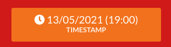
…while without date-format it would be:
Formats supported are:
- dd : day in two digits padded by zero
- MM : month in two digits padded by zero
- yyyy : year in four digits padded by zero
- hh : hour in two digits padded by zero
- mm : minute in two digits padded by zero
- ss : seconds in two digits padded by zero
Supported payload formats that can be parsed by date-format:
- “2021-05-13T14:00:00.000Z” (Date.toISOString)
- 1620923335.936058 (time stamp as reported by python time.time ())
5. List of elements and controls
5.1 Header declaration (<header />)
5.2 Stat declaration (<stat />)
Allows to show a box with a particular data from a topic filter, optionally defining labels, suffixes, max values, etc to express different situations. Here are some examples:
- Show a very simple box with a single data from a topic. The following example will show data from that topic or first attribute from JSON object found inside that topic:
<stat topic="central/floor4th/phase1/current" />
- To limit/configure the particular element to show inside a JSON object, use the following. It assumes there is a JSON object located at central/floor4h/phase1/current that has an attribute called amps:
<stat topic="central/floor4th/phase1/current" attr-name="amps" />
- Use suffix= and/or prefix= declarations to better express type of data:
<stat topic="central/floor4th/phase1/current"
      attr-name="amps" suffix=" A" />
- Add an icon to complete this stat box (icon=“plug”):
<stat topic="central/floor4th/phase1/current"
      attr-name="voltage2" suffix=" A" icon="plug" />
5.3 Button declaration (<button />)
Allows to create a button that will send a message with a particular topic, qos and payload once pressed. By default a toast message is shown after the button is pressed to give feedback to the user that it was pressed.
- Here is a very basic example that will send a QoS0 empty message to the provided payload, showing a toast message once the button is pressed:
<button label="Turn on lights"
        topic="home/one-of-them/light-bulb/living-room/10"/>
- You can configure button color and icon used by using “color” and “icon” attributes:
<button label="Turn on lights"
        topic="home/one-of-them/light-bulb/living-room/10"
        color="green" icon="lightbulb"/>`
- You can extend your definition to disable toast message (so nothing is shown when button is pressed):
<button label="Turn on lights"
        topic="home/one-of-them/light-bulb/living-room/10"
        color="green" icon="lightbulb" disable-toast="yes"/>
- You could also configure toast icon and toast-duration (the amount of time toast message is shown) by using toast-icon= (which works with same format and features like regular icon= declaration) and toast-duration= (which defaults to 1400, allowing to configure how many milliseconds must wait the platform before closing the toast message):
<button label="Turn on lights"
        topic="home/one-of-them/light-bulb/living-room/10"
        color="green" icon="lightbulb"
        toast-icon="info blue" toast-duration="30000"/>
5.4 Message declaration (<message />)
5.5 Grid declaration (<grid />)
5.6 P declaration (<p />)
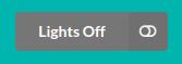
5.7 Toggle button declaration (<toggle />)
A toggle button allows to create a panel item with opposite/complementary states like: ON/OFF, running/stopped. It also has support for <check-status> which allows configuring different topics, payload, qos and toast messages according to the last state found associated to a given topic:
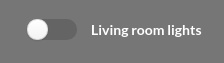
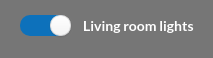
Here is how to declare a fully functional <toggle> button:
<toggle label="Living room lights"

        on-topic="lights/living-room/status"
        on-payload="{'status' : 'on'}"
        off-topic="lights/living-room/status"
        off-payload="{'status' : 'off'}"

        on-toast-title="Lights ON"
        on-toast-message="Turning on living room lights"
        off-toast-title="Lights OFF"
        off-toast-message="Turning off living room lights">

    <check-status topic="lights/living-room/status">
      <if access-attr="status" is="on" set="checked" ></if>
         <!-- this rule is not needed as toggle starts as unchecked by default -->
         <!-- but it is left as an example that you can configure several if rules -->
      <if access-attr="status" is="off" set="unchecked" ></if>
    </check-status>

 </toggle>
Here is how it works:
-
<toggle> declaration configure label to show along with topic and payload to send for ON and OFF state.
-
Then we have toast declarations, which are optional. They allow to configure message and title to be shown to the user interacting with the toolbar so the panel can provide feedback.
-
Inside <toggle> you can find a <check-status> declaration that is attached to a topic to watch for its last content published (in this case lights/living-room/status).
-
Inside there are at list of <if> declarations. Order matters. Each of them has configuration to access the last content found on the provided topic, following rules defined by 3. Integrating data from topics (in this case access-attr=“status”). This mean that it is expecting json content with an attribute obj.status.
-
In case obj.status is=“on”, it updates <toggle> to set=“checked”. Otherwise, set=“unchecked” is configured.
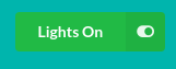
5.8 Rotation button (multi-state <button/>+<check-status />)
Combining <button /> and <check-status /> you can create a multi state button that can publish different messages according to the last status observed in such topic. Here is an example:
 <button label="Lights On" topic="lights/living-room/status" payload='{"status" : "on"}' color="green" toast-icon="right angle big green" margin="24px" transition="fade up">
    <check-status topic="lights/living-room/status">
       <if access-attr="status" is="on"
           set-label="Lights On" set-color="green"
           set-payload='{"status" : "off"}' set-icon="toggle on"
           set-toast-icon="right angle big grey"></if>
       <if access-attr="status" is="off"
           set-label="Lights Off" set-color="grey"
           set-payload='{"status" : "on"}' set-icon="toggle off"
           set-toast-icon="right angle big green"></if>
    </check-status>
</button>
This example works as follows:
- We have the usual button declaration that provides label, color, icon, etc, along with topic to publish to and the content to be sent in such publication (payload=):
    <button label="Lights On" topic="lights/living-room/status"
            payload='{"status" : "on"}' color="green"
            toast-icon="right angle big green"
            margin="24px" transition="fade up">
-
That creates a button like:
-
Now we have a set of rules (<check-status />) attach to a topic (lights/living-room/status). This makes these rules to be activated (iterated in order) everytime new content is detected in such topic.
-
Next, we have two rules that reconfigures this button to make it change not only visually but also its behaviour:
       <if access-attr="status" is="on"
           set-label="Lights On" set-color="green"
           set-payload='{"status" : "off"}' set-icon="toggle on"
           set-toast-icon="right angle big grey"></if>
       <if access-attr="status" is="off"
           set-label="Lights Off" set-color="grey"
           set-payload='{"status" : "on"}' set-icon="toggle off"
           set-toast-icon="right angle big green"></if>
-
What’s the result? If the user loads a panel with this configuration will change automatically button status and behavior according to last publish message on lights/living-room/status, thus causing the button to be shown like this when current lights are on:
…or as follows when lights are off:
6. Making panel items to react to last status (<check-status />)
You can make panel items like <toggle/> or <button/> can be configured to react to last content stored in a particular topic. This can be useful to make <toggle/> and other elements to now what’s the initial state when loading a panel/dashboard.
Here is an example on how to use <check-status/> to configure toggle to react to last status published so it can be initialized with the right starting value:
<toggle label="Living room lights"
        on-topic="lights/living-room/status" on-payload="{'status' : 'on'}"
        on-toast="Turning on living room lights"
        off-topic="lights/living-room/status" off-payload="{'status' : 'off'}"
        off-toast="Turning off living room lights" margin="24px" >
  <check-status topic="lights/living-room/status">
    <if access-attr="status" is="on" set="checked" />
    <!-- This rule is not needed as toggle starts as unchecked by default -->
    <!-- It is left as an example that you can configure several if rules -->
    <if access-attr="status" is="off" set="unchecked" />
  </check-status>
</toggle>
<check-status> structure is follows:
- First, a global node declaration attaches to a particular topic to get status change notifications:
<check-status topic="lights/living-room/status">
- Inside that node, there is a list of node declarations looking for matching content to apply action associated. Supported declarations are:
<if access-attr="decl" is="value" set="value-to-set" />
<if attr-name="decl" is="value" set="value-to-set" />
The following attributes can be used to change behavior for affected component. These attributes are to be used inside <if /> rules and are applied when is= value matches:
- Use set= to change componet state like:
<if access-attr="decl" is="value" set="checked" />
-
Use set-color= to change component primary color.
-
Use set-topic= to change next publication topic.
-
Use set-payload= to change next publication payload.
-
Use set-icon= to change primare component icon.
-
Use set-label= to change primary component label.
-
Use set-toast-icon= to change next publication toast icon.